At Northern Edge Algonquin, our brand has never been just a logo.
It has always been a reflection of the land, the people who gather here, and the spirit that continues to shape our work.
Over the years, our visual identity has shifted alongside our programming, our language, and the ways people connect with retreat experiences. What we’re seeing now isn’t a rebrand — it feels more like a coming home.
Where We Began
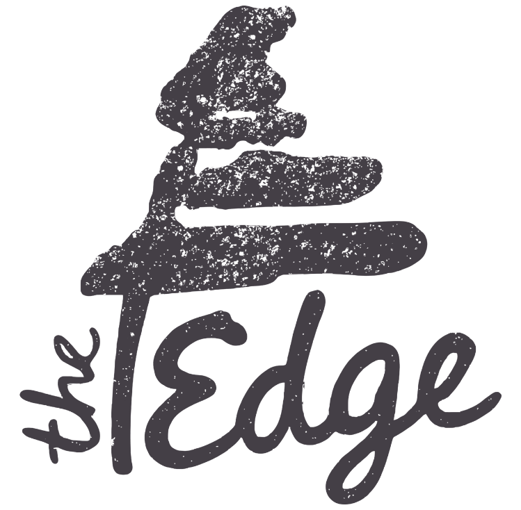
In the early days, the Edge’s original logo carried deep symbolism rooted in this place.
The windswept pine represented the white pine that once stood outside Points North — a quiet guardian that many guests came to associate with the spirit of the Edge. The flowing word art evoked shoreline and island landscapes familiar to this region, while the spiral sun hinted at movement, growth, and the path forward.
Even then, the symbols weren’t just decorative. They told a story about resilience, relationship with nature, and the idea that transformation happens slowly — like a tree shaped by wind.
The Compass Years
As our programs evolved, so did our branding.
In the mid-2010s, our logo system reflected a more structured era — compass points a compass rose depicting a journey through the Amable du Fond and “sub logos” representing both various program branches and elements. The spiral became a “spirit” sub-logo, joined by icons representing evolution, growth, inspiration, connectedness, and exploration.
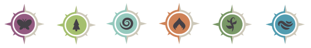
These marks helped us navigate a time of change. They gave shape to different offerings, and it was during these years that we formally shifted away from offering overnight canoe trip adventures and experiential education programs for youth – in order to focus more fully on retreat programs for adults.
We love our compass logo, but lately it hasn’t felt as connected to who we are now.
Returning Home
We are continuously drawn toward language and imagery that feel grounded, human, and connected to real experience.
A handful of years ago, we brought in a selection of sweaters to our gift shop: crew necks with our retro logo embroidered on the front. As a team, it felt really nice to wear these “retro” sweaters, and we found our guests were drawn to them too.
We’re not looking to reinvent ourselves, and we weren’t looking to design a new logo. But more and more, we’ve felt drawn to the symbols that have always mattered to us, and we felt it was time to simplify and let those symbols speak more clearly. It’s an evolution back toward the spirit that has always lived here.
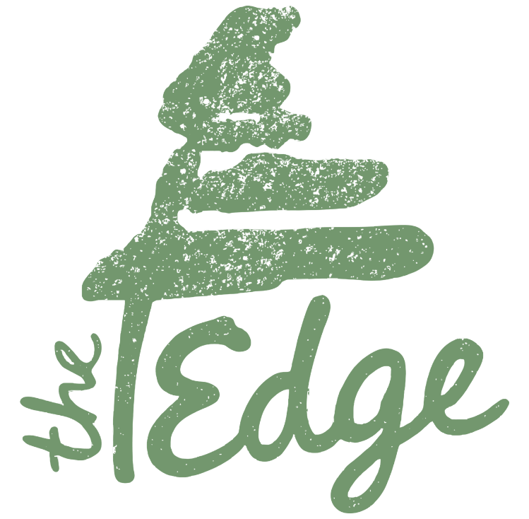
In many ways, what we’re doing now is both simple and meaningful: we’re returning to our original windswept pine logo — the mark that has always felt closest to the spirit of the Edge — while carrying forward the colour palette that emerged through the compass years.
The colours of our compass logo set continue to live on, not as separate identities but as part of a unified visual language. It feels less like changing direction and more like letting the Edge’s story come back into focus.
Alongside this return, we’re Introducing a new symbol that feels deeply connected to our history: “the Edge stamp”
In the early years of the Edge, our friends Dave and Monica McComiskey created pottery for us using a handcrafted stamp. That small, simple mark — pressed into clay — carried a quiet sense of belonging and craft. The last “Edge” mug sits at Tim’s desk in our office. Recently, as we discussed pottery and logos, what stood out about this mug wasn’t just its nostalgia, but its shape: The way the stamp sits within a triangular form feels like it is pointing north, echoing the compass imagery that has guided the Edge for the past decade.
/
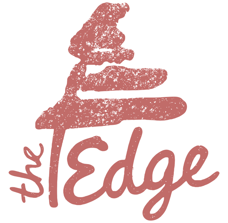
Our new stamp logo grew from that inspiration. The text was crafted to live within a triangular shape — a subtle nod to direction, grounding, and place — while keeping the simplicity and handcrafted feeling of the original pottery mark: handmade, human, and relational.
Where our primary heritage logo again represents Northern Edge Algonquin (the landscape, the history, the spirit) before a guest arrives and in professional settings, the new stamp reflects the feeling after someone has been here, when “Northern Edge Algonquin” simply becomes “the Edge”.
Symbology
The Windswept Pine
The pine tree remains at the heart of our identity, representing the strong roots of the white pine that once stood outside Points North.
Evocative of The West Wind by Tom Thomson’s (another connection to our location on Kawawaymog Lake), it symbolizes endurance and growth. Like the tree itself — shaped by wind yet deeply rooted — the Edge continues to evolve while staying grounded in its values.
The Spiral Sun
The spiral sun has traveled with us for decades.
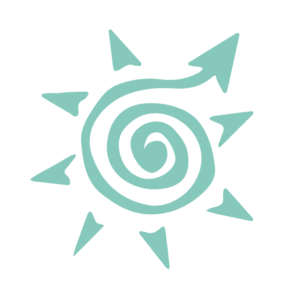
Originally drawn as a turtle for one of Todd’s early SoulQuest programs, it later became a sun, then a star within the compass logo, and now lives on as an iconic symbol of spirit and continuity.
It reminds us that growth is rarely linear — it circles, returns, and deepens.
Icons That Carry the Compass Forward
You may begin to notice new icons appearing across the website — gentle, hand-drawn symbols representing experiences, inclusions, and moments at the Edge.
These icons carry forward the spirit of our earlier compass sub-logos, and are joined by many others. They now live as a shared visual language woven throughout the site — a quieter compass guiding how we describe our offerings.
You've been signed up to receive news, updates, stories, and special offers from The Edge!